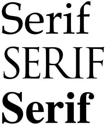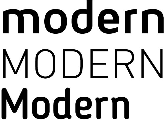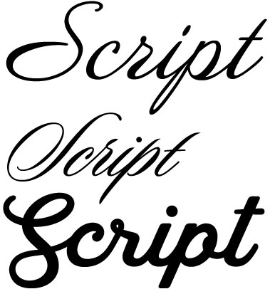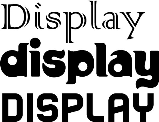
In its simplest form, typography is made up of shapes. It is a fundamental form of visual communication and always has been since the dawn of time when man first developed an alphabet and written communication was created. They are abstract symbols – a combination of straight lines, shapes and curves that represent letters, that when combined represent words, and convey language.
But fonts also convey more abstract forms of communication. They convey tone, emotion and attitude and have a huge factor in communicating a business’s brand to its customer base.
Understanding this important fact ensures that your brand has a consistent “voice”. It is not sending subtle mixed-messages. And it’s not falling into the trap of that many do, simply because they don’t revere the power that typography – as a whole – has in the grand scheme of brand implementation.
Brand Fonts
To help, here is a simple breakdown of what a font’s style communicates:

- Stability
- Objective
- Clean
- Modern
- Approachable
- Sensible
- Honest
- Technological
- Sophisticated

- Tradition
- Respectable
- Formal
- Reliable
- Comforting
- Timeless
- Academic
- Important
- Timeless

- Strong
- Progressive
- Stylish
- Chic
- Corporate
- Unconventional
- Influential
- Logical

- Luxurious
- Elegance
- Affectionate
- Welcoming
- Personal
- Feminine
- Fancy
- Exceptional

- Unique
- Expressive
- Amusing
- Friendly
- Quirky
- Eccentric
- Trendy
- Vintage
Whether the lettering style in a brand’s logo, the font selected for a print ad or paragraphs in a cover letter, what font is being used is part of the brand’s visual communication. Remember this fact in order to ensure the integrity of your brand and overall messaging is consistent in what it is saying.

