When you think of global brands of the last half-century, companies like Apple, Nike, McDonald’s, Coca-Cola, Disney easily come to mind. Their visual brand is so instantly recognizable. Whether it is the Swoosh or the Golden Arches, their brand needs no name attached to it and transcends all language barriers and international borders.
Another company that easily makes this list is Starbucks. What was once a humble venture on Pike’s Street in Seattle has grown to a global enterprise with over 23,000 locations.
And since its inception, it visual identity has slowly evolved over the decades.
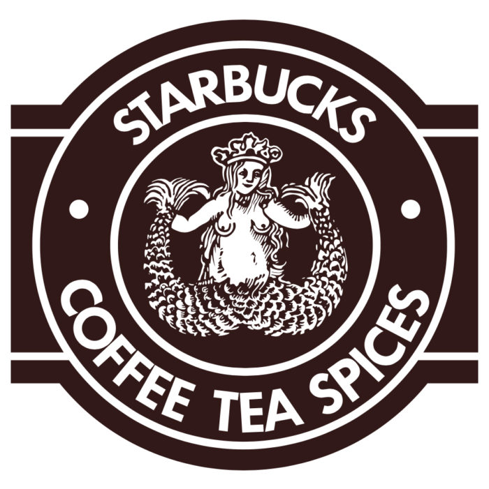
1971

The initial logo was inspired by a two-tailed mermaid from an old 16th Century Norse woodcut to convey an association with the old-world seafaring coffee trade. Thus, the Starbucks’ “Siren” was born.
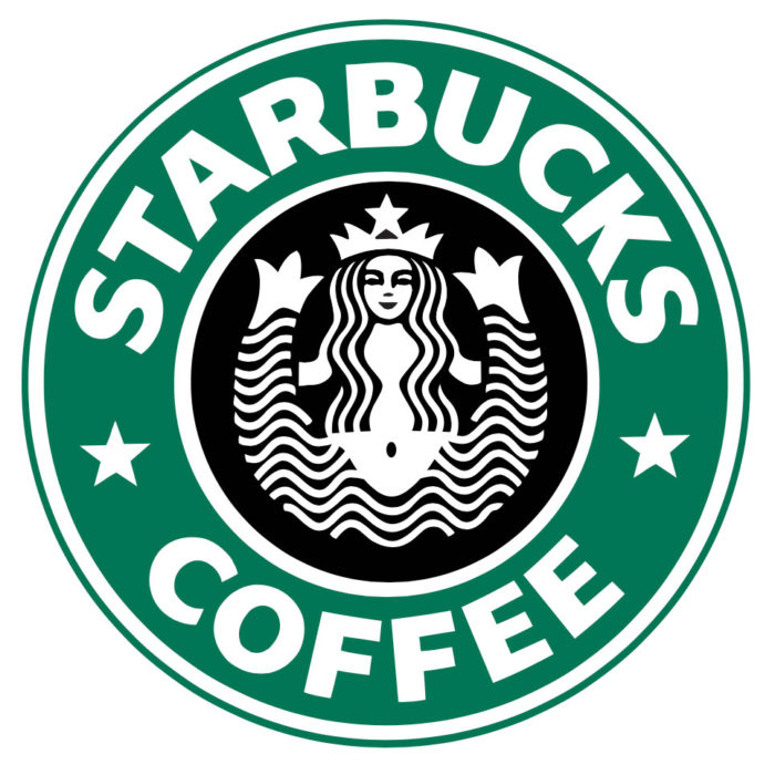
1987

The logo was then refreshed with a green color palette and the “Siren” was given a more modern design approach. The name was also changed to “Starbucks Coffee” from its original name of “Starbucks Coffee Tea Spices”.
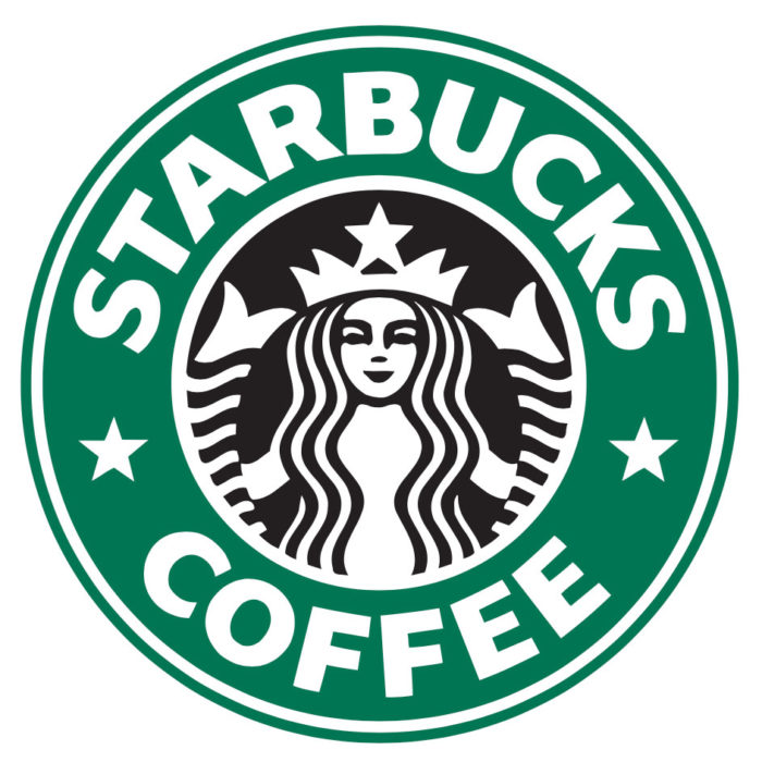
1992

By the 1990’s, Starbucks brand had evolved so that the “Coffee” portion of its name could be easily dropped from the conversation and the word “Starbucks” equated coffee and coffee culture.
The logo was then modified so that less of the Siren’s tails were visible and the rendering was more refined.
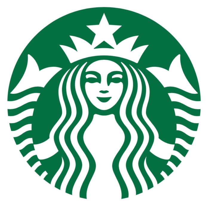
2011

It was in 2011 that the brand for Starbuck’s had received such global recognition that it could follow the likes of the previously mentioned companies like Nike, Apple and McDonald’s and drop the name from its visual brand. The brand saw further minor refinements to the rendering of the Starbuck’s Siren and its signature green color was now center stage.
This brings us to the current visual identity that Starbuck’s now uses.
The Next Step…
What makes the Starbuck’s brand identity so strong is that the company could simplify the brand further to a single green dot and it would not lose any brand recognition. Its brand can naturally evolve to a simple green circle and it would be recognized around the world as Starbucks Coffee.

Now that is brand design at it purest form. Consumers would know instinctively what the visual mark represents. The industry would acknowledge it. And brand designers like us would applaud.
When the brand can evolve over time to the point where it has reached a more refined form and the company could literally make zero announcements or proclamations of its brand refresh and the world would follow… that’s brilliance.
Not often does a brand come along where the world can see where its evolution will go, before it actually happens. If AT&T’s brand were to evolve, it would be hard for everyone to unanimously arrive at the same possible conclusion. Not bad for a global entity with its humble beginnings as a corner store located one block from a popular fish street market.

