Every business wants a memorable logo or mark to symbolize its brand. Once they have one, there is an strong desire to reproduce it on everything. Business cards, t-shirts, vinyl stickers, signage, etc. And this can be a good thing when properly done.
However, there is a very common problem with many people to be more mindLESS – rather than mindFUL – when it comes to reproducing the logo in white or light color against a dark background color.
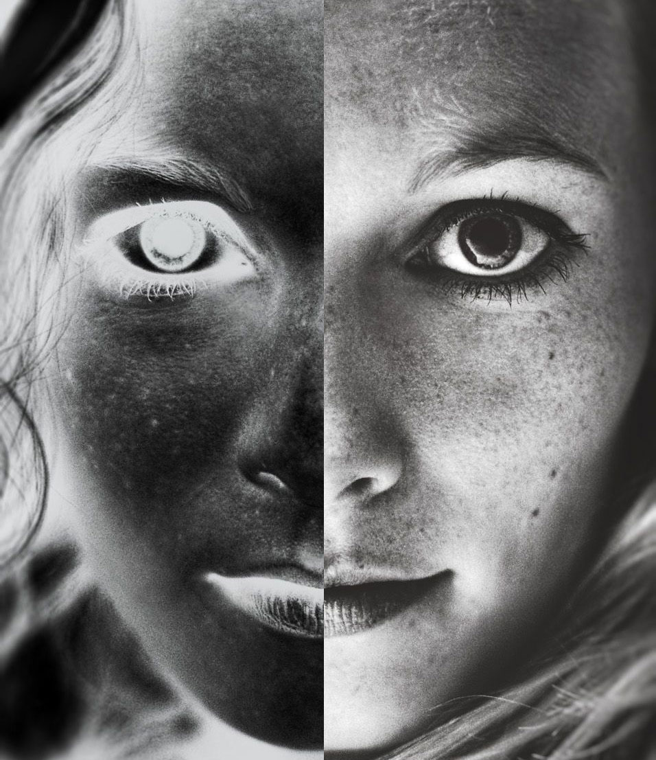
At some point, everyone has seen a photographic negative. What is white is black and what is black is white. It can be a rather disorientating experience both to the eye and mind.
The same disorientating visual experience can be made when a logo that was strategically designed with intentional dark and light areas is simply reproduced in a different color without thought or concern. This is particularly apparent when the brand involved faces, animals, profiles, and symbols that communicate areas of light and shadow. Those areas are now opposite to the eye and gives an entirely different message.
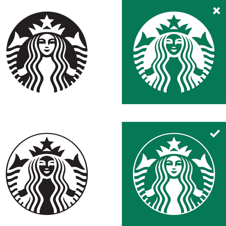
A great example of this is the infamous Starbucks Coffee logo. The look of the internationally recognizable siren is greatly altered if the artwork that is usually used to reproduce it is reproduced in white. Dark areas around her eyes are now the highlight areas. In order to properly reproduce the logo against the a field of the Starbuck’s green, an alternative version of the logo needs to be used – one that looks disorientating by itself, but when reproduced in the proper context, corrects the issue at hand.
Sometimes the improper use of a logo not only creates visual confusion, but also changes the very association the graphic was supposed to have with a brand.
Case in point: California Coast Beer Company’s logo was created with the intentionality of conveying a grizzly bear whose open mouth can also be seen as a pint of beer with a foamy head.

If the logo is printed white, the result is that the intended native-bear of the state is now represented by a polar bear and the pint of beer is effectively lost to the viewer. Other minor issues of the bear’s nose (which should be black) is now white and the subtle pine trees in the negative space underneath are now made too apparent to the eye.

To effectively create a cohesive brand mark, an alternative version of the logo is created that is to be solely used when the logo is to be reproduced on a dark area.

Remember, having a fabulous visual brand is one thing. Respecting the visual integrity of that logo and ensuring it is properly reproduced across all platforms and touchpoints with your consumer is another. If possible, always consult your brand styleguide or make sure that your guide is always sent to anyone that will be responsible for its reproduction. The more cohesive a brand, the more successful it will be.
