The word “negative” — rightfully so — has a negative connotation. Which is why a majority of people view negative space as wasted space. But it is in fact a very crucial design element that is paramount to a successful brand and all of its forms of visual communications.
Much of this misunderstanding comes about by businesses who have purchased valuable space for their marketing (ex: printed magazine ad or billboard) and feel the urge to fill every bit of space with information to thereby “maximize” their investment. But this is a wrong track of thought. Negative space is in fact NOT wasted space but is purposeful and always intentional. Also casually referred to as “white space” (though it can also be a field of color or even a subtle, blurred image or element), negative space at its core is blank space. But this blank space is powerful in that it creates visual silence. A calm for the eye and the brain to rest amongst a constant visual stimuli around us. Similar to how one voice can easily be discerned when there are only a few people in the room, it is drowned out amongst a packed house party. When everyone is talking, no one is heard. When there is lack of negative space in a layout, what you want your audience to focus on never gets the attention it needs. Among the visual clutter, it gets passed over.
Negative Space is crucial in the overall design of your brand and implementation of your brand. This core design component holds the design elements together. It frames, organizes and highlights various hierarchies of your visual brand. The key to understanding the power of negative space is that it is based on Gestalt’s Principle of Proximity. This design principle exists because of the human brain’s tendency to perceive visual objects close to each other as related somehow. It is how our brains gather and process data.

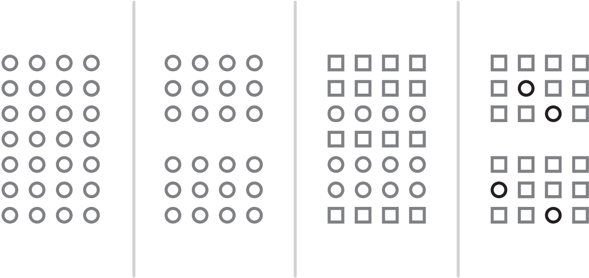
As an example, look at the 4 examples above. On the left, the eye and brain are trying to assess all of the elements and create order (that’s what the brain does). By adding in negative space in the next example, the brain naturally forms two groups and is able to process them better. Even simply clustering like-objects together doesn’t assist the brain in processing as much as negative space. The far right image has your brain automatically grouping the objects by proximity to one another, not by the similarity of the individual objects.
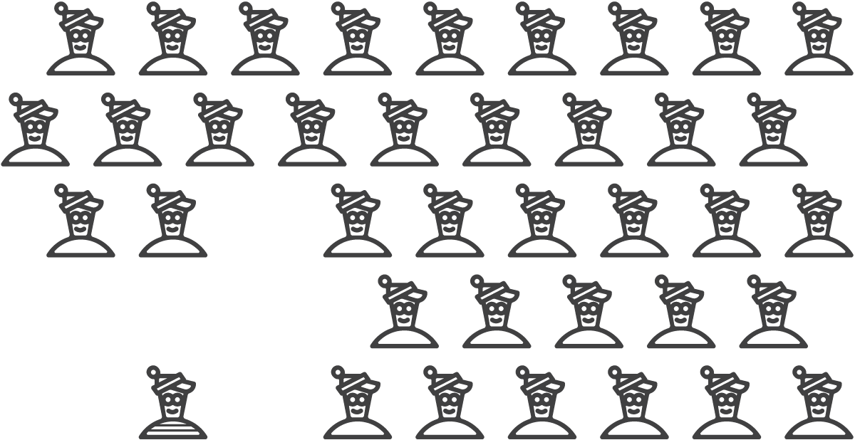
Ever wonder why it is so difficult to find Waldo in the “Where’s Waldo” puzzle books? It is because there is virtually no negative space on the page. The brain has a hard time processing what it sees even when it is specifically trying to find the one guy with a white and red striped shirt. However, if the pages utilized blank space so that there were fewer and smaller numbered groups of people, the brain would be able to process these scenes faster and therefore spot the elusive Waldo sooner, or single him out completely.

Negative space can be used to draw the viewer into a layout and focus on the key messaging or visual your brand is trying to communicate. It can be used intelligently to cause the eye to follow a different visual path. And it can even be used creatively to convey concepts in a logo as seen in the brands for FedEx, NBC, Girl Scouts and even one of our own award-winning brands. Negative space on a micro-level is equally important. For instance, how we space letters among words, space words among sentences, and space each line of text or each paragraph of copy. A paragraph devoid of any intentional space among its components would be a word-search puzzle where every letter is equidistant from each other and the brain takes a while to make sense of what it sees.
Negative space and the use of it in design and in brand is not a negative thing. It is a positive thing. It is more than just a positive thing. It is a great fundamental key to understanding the mind of your audience and how it works, and using it strategically to maximize the effectiveness of your brand.

