Nestled within a portion of Manhattan is Hudson Square – an area that was its former printing district. Today, it is an area that is bustling with over 40,000 workers in around 1,000 businesses. It is a place now that caters to students, visitors and a growing population residing there. It is also a creative hub within the region, one where technology and imagination are coming together.
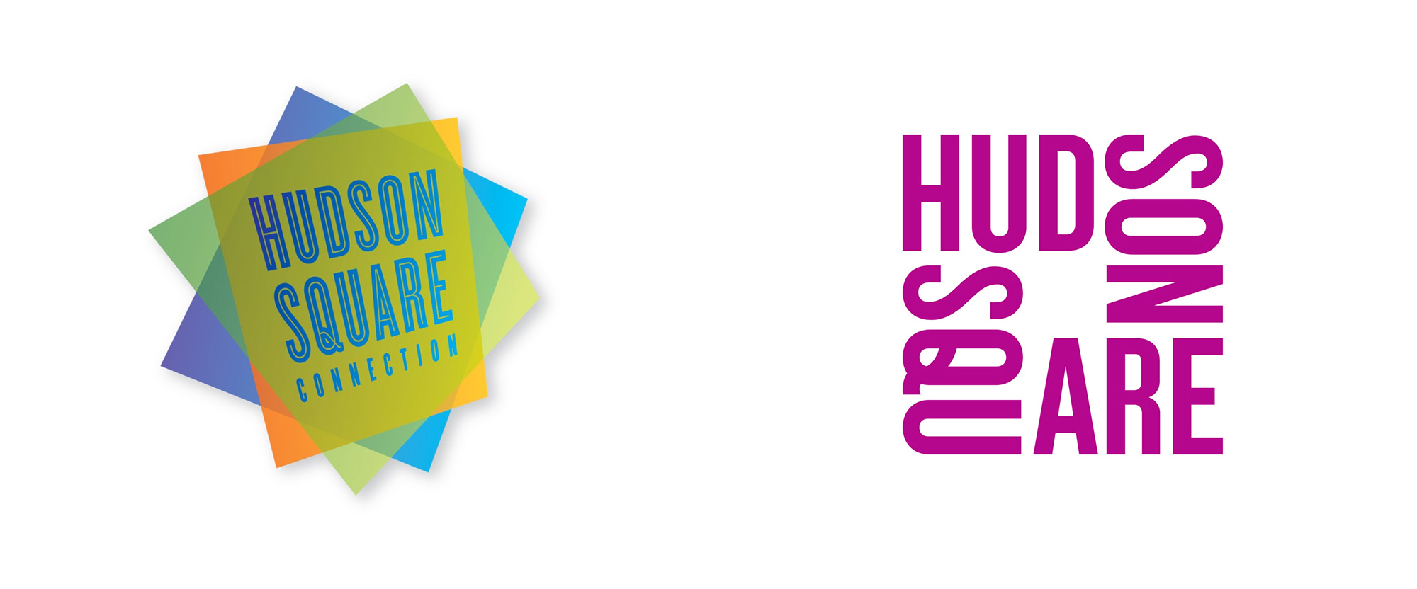
The old brand, while having some sense of dynamics due to its off-rotation and translucency, was clearly plagued with some issues. The first of those being some legibility issues with regards to its color palette. It lacks contrast and strength. With concern for reproduction, it lacks scalability and adaptability to how it could be visually conveyed. Subtle details found in the main lettering are lost when the brand is sized down.
In short, successful brands are ones that non’t need a dozen iterations of itself depending on the application. Less is more. Strong brands can easily adapt without losing their primary design qualities.

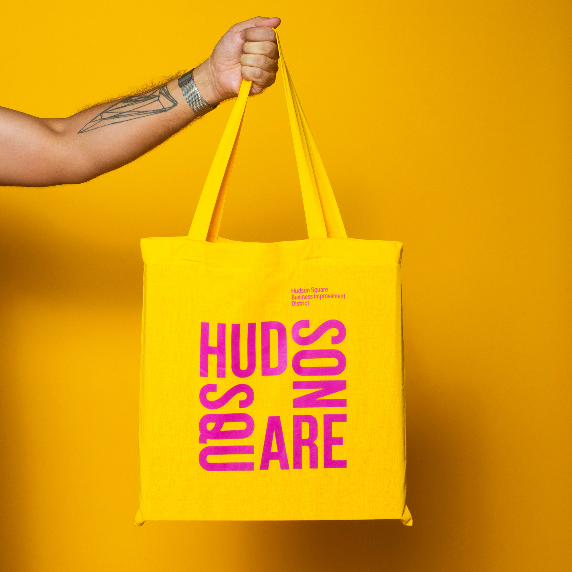
The new brand, designed by New York agency Applied, makes a statement. It shows less regard for initial legibility in favor of a more creative solution that causes only about a second to register to the viewer’s mind the name.
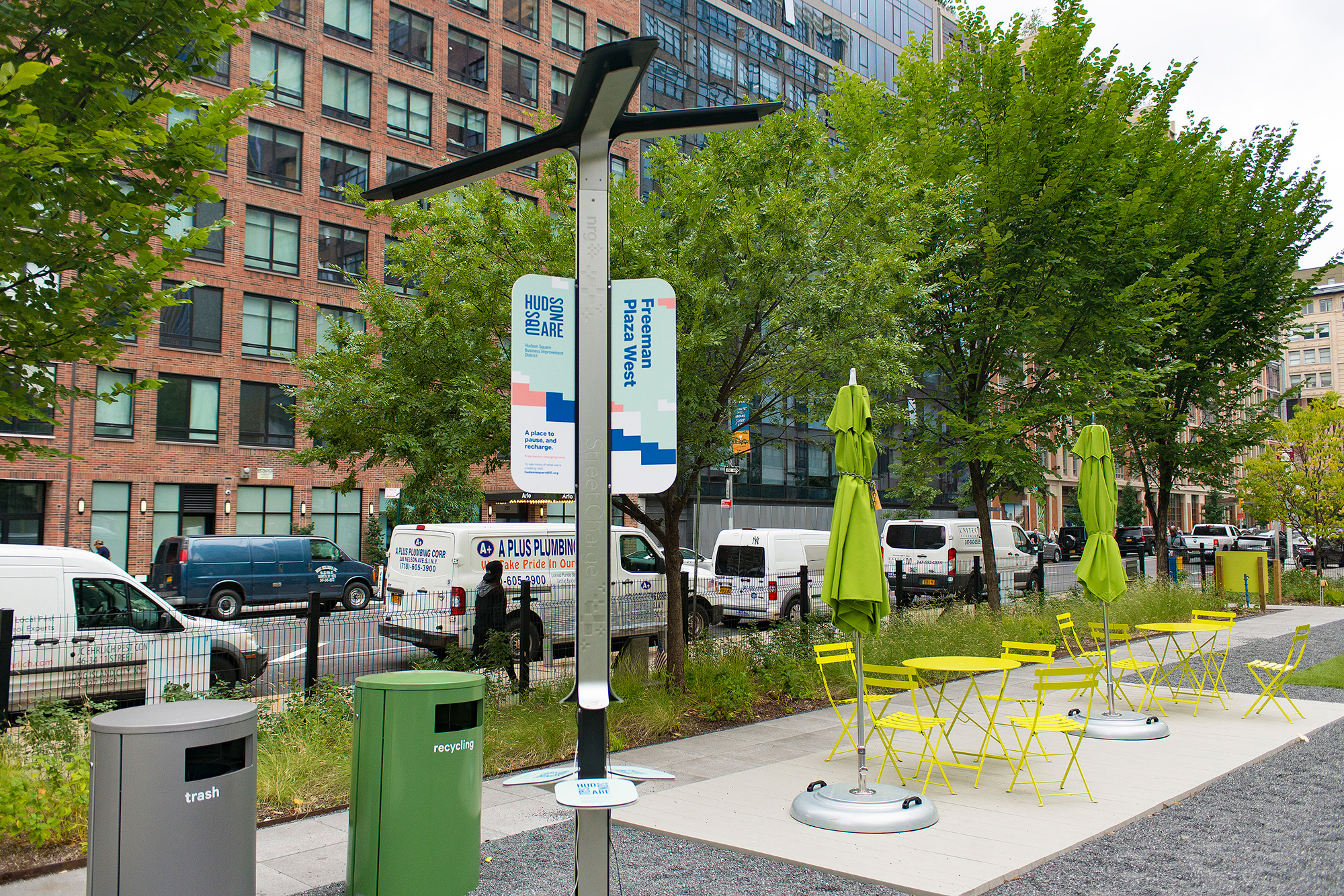
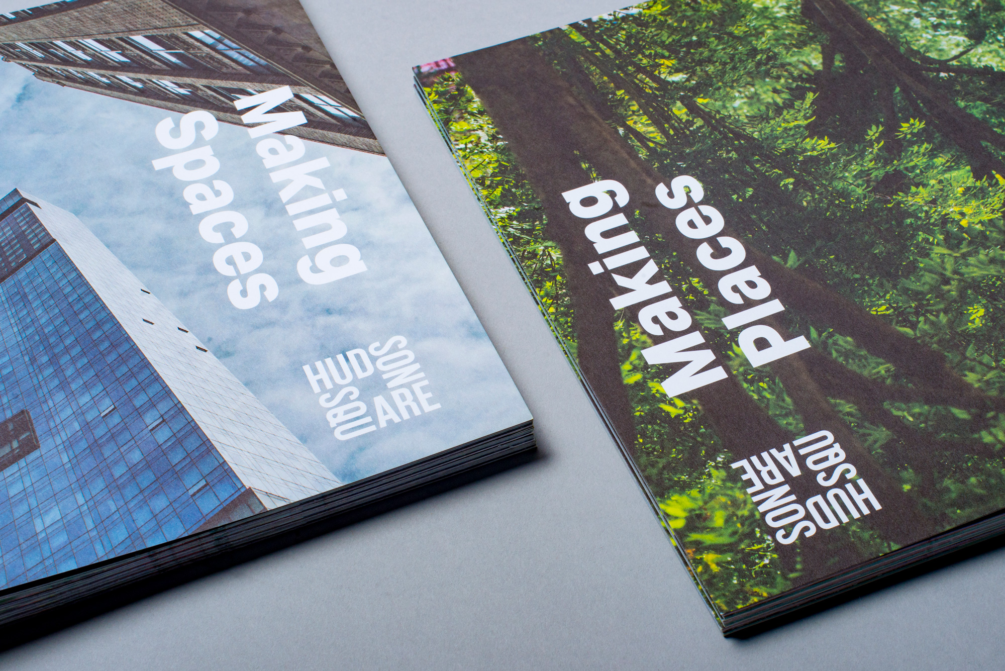
It oozes New York attitude and has a loud visual voice that reminds me of the great works of Paula Scher. With a variety of color palettes, a simple one-color solution that is easily adaptable, and a creatively hip vibe to it, this new visual identity achieves what its predecessor was not able to achieve – something fresh but that has design homages built into it and adaptability with endless possibilities for brand expansion.
Well done Hudson Square BID and Applied!

