Your brand has a color. A very specific color. One that is specified in all color systems – hex code, RGB, CMYK and the whole range of Pantone system swatches. A color that is proudly displayed and integrated into your branding.
Now there are some occasions that your logo’s color may look off or different. Particularly with printing, the type of substrate can make a huge difference. But other times it has nothing to do with type of printing surface. For instance, examine a canned sign of your logo on the exterior colored wall of a building. Now it becomes an issue of when it is just by itself versus being placed adjacent to –or surrounded by– another color.
Some businesses can be easily confused and make a false assessment that their logo color is wrong. Many –rightfully so– will then go back to their design agency and figure that the wrong file was used or there was an error on their part and ask to fix it.
When it comes to this visual problem, sometimes this can be avoided. And other times, it is just a fact of life.
Time for a little lesson in color theory.
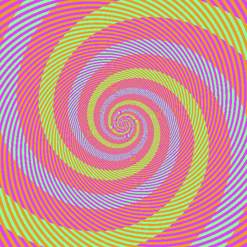
Believe it or not, the image below appears to have spirals of green, blue, and pink/magenta. But what appears to be blue and what appears to be green are actually identical colors.

Don’t believe me? The squares below are taken from sample pixels.

What’s the reason for this mind-blowing effect and why you were so certain that you were looking at stripes of green and stripes of blue? They look like different colors because our brain judges the color of an object by comparing it to surrounding colors. In this case, the stripes are not continuous as they appear at first glance. The orange stripes don’t go through the “blue” spiral, and the magenta ones don’t go through the “green” one.
Still not convinced? Below is the same image but with the orange stripes that are causing the confusion with what our eyes see and what our brain translates.

By surrounding this image with the exact same color that appeared both blue and green to our eyes, you can now be convinced they are in fact the same color.

Now do you believe me? When the orange stripes are re-introduced into the image, our eyes register the surrounding colors and, essentially, cause our brains to misinterpret the color that exists.

Since color accuracy is super important, just remember the adjacent environment you put it against, as this will come into play in how its color is displayed. Taking into account that your color may be affected and either adjusting either the surrounding colors or how the logo is being displayed can help maintain the integrity and consistency that your brand deserves.

