Those of us in the design, advertising and marketing industries know the impact that color has on audiences. However, most individuals or business owners that may make decisions or oversee people that might make color choices in their marketing and branding may not. And it can have a huge impact on the effectiveness on branding.
Color plays a huge part in how a company’s brand, product or advertisement is perceived. It plays a huge part in what it communicates.
Picking the right combination of colors to use isn’t about what feels good or looks good. It is about who you are trying to communicate to – your target audience – and what you are trying to say – your message. This can apply to a visual advertisement, a sign, your logo, your product’s packaging… just about anything that might use color in your arsenal to communicate to your current and potential customers.
In order to best use color effectively, you need to know how our minds perceive color and what psychological associations we have with color.
Here are the positive and negative effects color has to our minds:
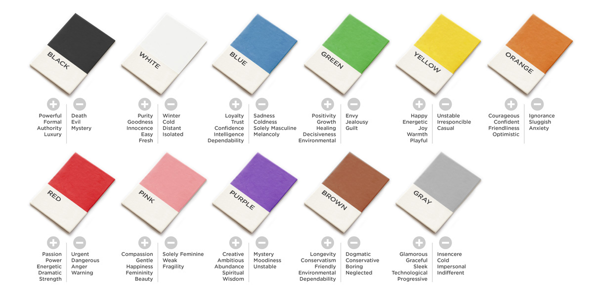
BLACK
Black represents power and authority. It is a timeless color that has never gone out of style. It is bold and usually finds itself used a lot in the fashion industry and with brands that specialize in luxury. It is sophisticated, classy and elegant.
WHITE
White is associated with purity, innocence, honesty, safety. It can be used to project a certain level of neutrality, ease of use and freshness.
BLUE
Blue represents dependability, loyalty, trust and reliability. It is secure, calming, peaceful, harmonious and mature. Physiologically, it actually curbs the appetite. It is used excessively in the financial sector, social media and many corporate industries.
GREEN
Green represents positivity, decisiveness, growth and fertility. It is used to convey health, environmental awareness, nature, tranquility and calmness. Many times it is used in conjunction with organic, social awareness sectors and the energy industry.
YELLOW
Yellow represents warmth, positivity, cheerfulness, joy, and happiness. It is used to convey an energetic tone that is light-hearted, playful and is very effective for all ages and is used a lot in the fast-food industry as it physiologically stimulates appetite. Ever wonder why the famous fast-food arches are yellow?
ORANGE
Orange is inviting and represents optimism, friendliness, and light-hearted fun. It is used to convey confidence, courage and enthusiasm. However because of its association also with caution, use it too much and it can create anxiety.
RED
Red represents passion, urgency, power, love and danger. It is used to draw attention and can convey drama, strength, excitement and energy. This is the one color that may have the most physical effect as it affects the nerve impulses and raises blood pressure and heart rate.
PINK
Pink represents compassion, health, femininity and delicacy. It is used to convey sweetness, kindness, gentleness, vibrancy and beauty.
PURPLE
Purple represents wisdom, royalty, respect, imagination and creativity. It can evoke wealth, luxury, abundance, spirituality and ambition.
BROWN
Brown represents longevity, dependability and friendliness. It is used most to address the outdoors, environmental awareness and conservatism.
GRAY
Gray represents technology, gracefulness, sleekness, glamour and practicality. It is used to convey a futuristic and progressive approach, and evoke calmness and neutrality.
So next time you are making decisions that involve color, don’t just pick a color because it is your favorite. Know that color plays a large impact on what is communicated to your audience. Use color intelligently, both in a liberal and minimal capacity, for your benefit. While there are no absolutes or hard-fast rules when it comes to color, be mindful of your target audience and their response to color, not your own. Factors that can affect their response to any of the above associations are age, class, gender, trends and global cultures (some colors mean something entirely different than in the U.S.).
Remember, you want to use color to help create a response from the viewer that will dictate how your market yourself and your product or service the most effective.
