If you are a business owner, chances are you have a new logo you just had created for your company or product, or you have an existing logo that you have been using for some time now. Either way, your logo is your identity. It represents who you are, what you do and what you bring to the consumer market you are in. At the very least, it is the core of your overall branding.
Making sure that you are making the most of your logo is key to helping you establish your brand and conveying professionalism, reliability, and quality.
If you are not having your brand managed properly by those equipped and experienced enough do so, chances are you – yourself or someone else within your organization – are responsible for using the logo and inserting it into a number of distribution channels. Whether in a digital format or in print collateral, where and how you use your logo is being left to others that may have the best intentions, but can fall short of this task.
One of the most common “crimes” that we see is the logo not having enough negative space around it.
Don’t choke it out.
People that are not very knowledgable about basic principles of design will generally insert their logo into an area but disregards the space around the logo. Negative space is a valuable design principle that refers to the empty space around an element (text, picture or another logo). When viewing a page, the human eye likes to have empty space to allow the eye to travel and rest as it spans the overall space.

Not enough space creates visual tension to the viewer and creates a sense of unrest. A crude, but perfect, example of this is if a logo on a white background with not enough negative space around it and it is placed against a dark background. The end result is a feeling of constraint and overcrowding. Almost like visual strangulation. It doesn’t help the overall layout and doesn’t help showcase the logo. Allowing plenty of space around your logo in relation to other elements is foundational to making sure it is taking center stage.

Give it room.
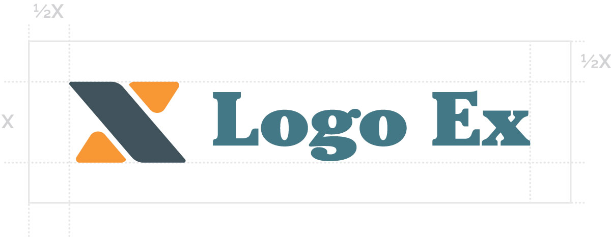
A key to making sure you are making smart choices with regards to sufficient space around your visual brand is to make sure you are giving it the minimum space needed. Designers typically use a one-half rule based on the height of the logo (which we consider “X”).

Now this visual bounding-box should be considered the minimum amount of space. In general, however, exceeding that amount is always going to be a good thing. The more the merrier.
A part of making sure your brand is standing out in the crowd, the best way to do that is the step away from the crowd just a bit to get more notice. Give your logo space around things like headlines, body copy, photos and design elements. Failing to do so will only make it blend in more and not stand out for its uniqueness. That might be great for Where’s Waldo, but not effective in building your brand identity.

